Information
Share
UX Case Study
Live ProjectProblem
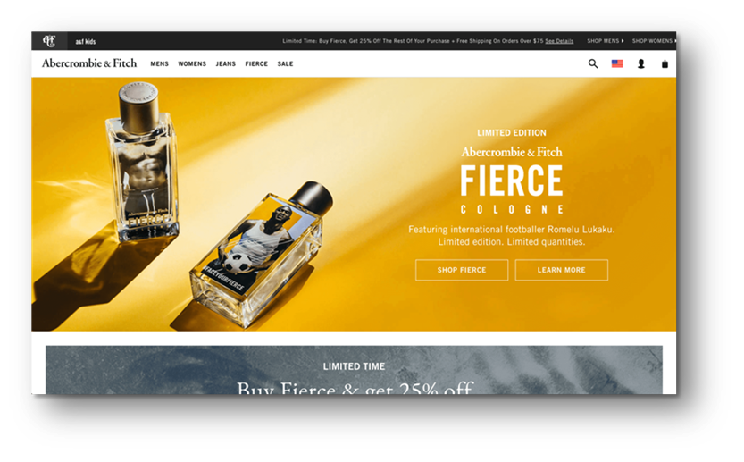
Microsoft Store product pages use a large size hero banner at top of its page with the height of 1192 pixels. Using a hero banner with that height pushing essential product contents below the fold making content less accessible. Figure 3 shows the current Microsoft Store product page.
Why this is a problem
Product content needs to be easily accessible by users. Placing key call-to-actions and product information below the fold make it difficult for users to navigate to products and discourage users to make an informed purchasing decision. Research study conducted by Nielsen Norman Group found out that users spent about 57% of their page viewing time above the fold and 74% of the viewing time was spent in the first two screenful.[1] Hence, it is essential to ensure key page contents are above the fold to increase conversions.
User observations and findings
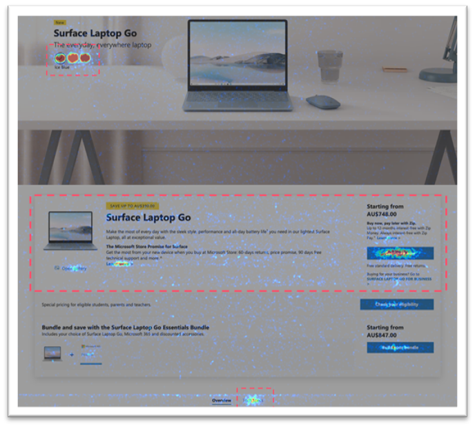
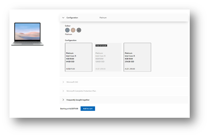
Conducted a mouse move heatmap analysis and observed user behaviours, it seems that the main points of focus for visitors are the colour selection, Tech Specs Tab and the Configure Now CTA and its surrounding area (Figure 1 highlights users’ main points of focus)
30% of all users never see the ‘Configure now’ CTA as they don’t scroll below the fold. Users that don’t scroll below the fold are often less likely to convert
9% of users did interact with the colour selection, which is an indication that adding essential contents or CTAs above the fold should be considered
Solution 1
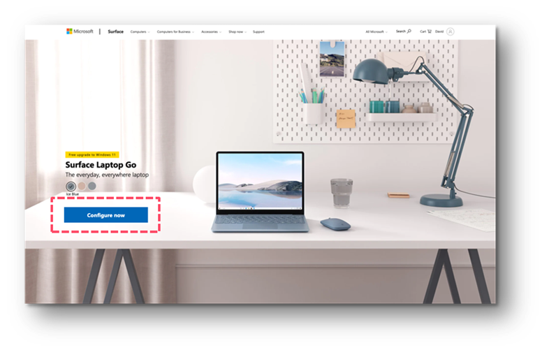
Add a ‘Configure now’ CTA above the fold. Figure 2 shows how the ‘Configure now’ CTA can be displayed.
Why this is a solution
Adding a CTA above the fold might tempt some of the engaged users to continue to the cart and/or checkout pages.
Solution 2
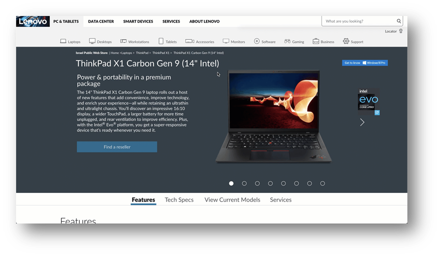
Reduce Hero image height size by half making it 596 pixels. Figure 3 shows how to display contents above the fold by reducing the image height making it less cluttered.
Why this is a solution
Hero image ends before the fold line so that it is clear there is more content below and encourages the user to scroll. Text is placed on part of the image that is not cluttered so it is easily legible. There are clear CTAs that help users browse specific products.
Solution 3
Add more information and interactive elements above the fold. Figure 4 shows how to add interactive elements above the fold.
Why this is a solution
Adding more information and interactive elements at the top of the page encourage the user to scroll and interact with the page.
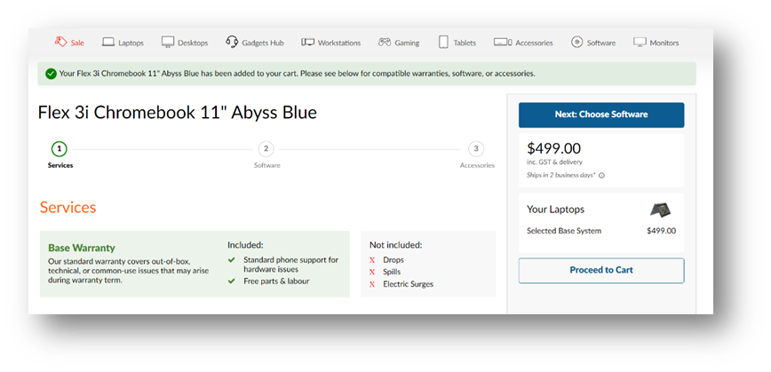
In Figure 6, there is (1) a CTA, (2) an image gallery that users can scroll through, and (3) multiple tabs above the fold that take the user to the section s/he is interested in.
Problem 3
Microsoft Store product pages have a configuration layout making the progression a stepped progression by vertically. This layout makes users to scroll up and down to configure their products. However, it’s a lot of work for users to scroll up and down to configure their products and select the desired products. Figure 5 shows the current Microsoft Store configuration page progressing vertically.
Why this is a problem
The vertical UX progression may increase users’ cognitive load making harder to digest page and discourage them to make an informed purchasing decision. Users may desire to configure their products without having to scroll at all so they can focus on the things they want and not on moving around the configuration.
User observations and findings
A user testing study was conducted with two users. To have a better understanding how the current experience, users were given a series of tasks to complete on Microsoft Store Product Configuration Page.
Tasks
Configure “Laptops” with “Intel Core i5 processor” and add “Microsoft 365 Family” and “Microsoft Bluetooth Mouse” on both desktop and mobile devices. How is the product configuration experience?
Configure “Laptops” with “Platinum” colour and select the “15’ screen size” and add “Microsoft Extended Warranty”. How is the product configuration experience?
Targeted Audience
Configured products online previously, familiarity with adding and/or removing product selections
Online shopping habits range from: “Few times per month” to “At least 5 days per week”
Mix of M/F between 32-36
Observations
Both users managed to configure laptops with Intel Core i5 processor and added Microsoft 365 Family and Microsoft Bluetoooth Mouse. However, it took users a few minutes to configure as some configuration elements were below the fold requiring users scroll up & down to select
One user couldn’t configure laptops with the Platinum colour and 15’ screen size as it had a smaller tap target on mobile device making it difficult to select on colour and screen size
Solution
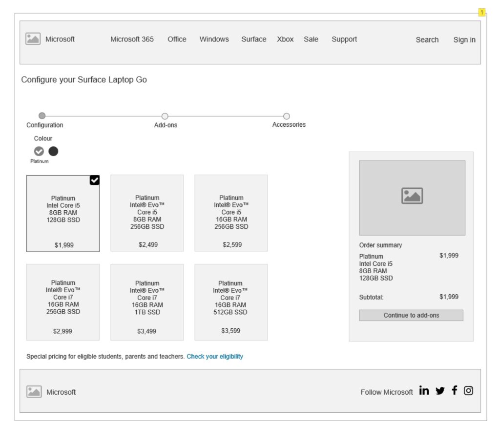
Change the configuration stepped progression by horizontally enabling users progressively select a desired product with an easy-to-navigate to the next screen. Figure 6 shows how the horizontal stepped progression can be implemented and streamlined.
Why this is a solution
The horizontal stepped progression streamlines the flow and help reduce users’ cognitive load with a shorter and easier to digest page. Instead of having all the products on the page at once, the horizontal version makes it more clear how many steps it would take to complete the steps to checkout, only shows the specific items to be considered for that step and shorten the product cards with a more compact design by reducing copy redundancy.
Wireframes
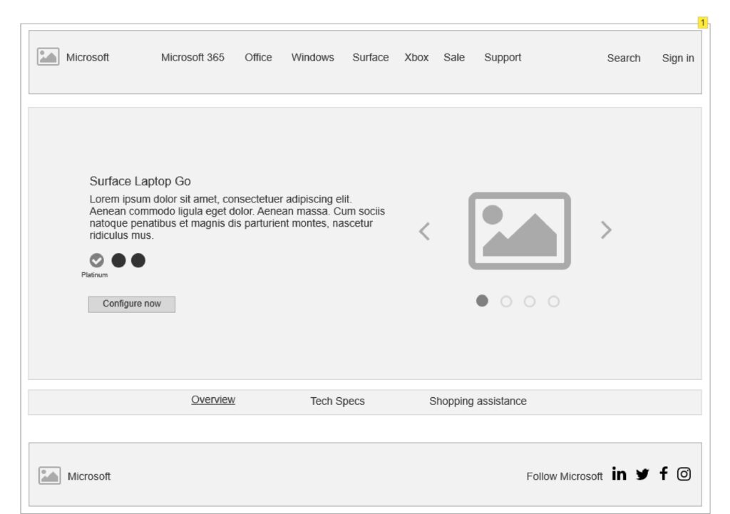
Various wireframes have been put together to visualize the new page layout. The first wireframe outlines configurator pages are on a horizontal layout where users can select the desired product without scrolling down on the page. The second wireframe outlines product pages encompases featuring where users can scroll across on the hero page for the products’ key features and functionalities.