Share
UX Case Study
Problem
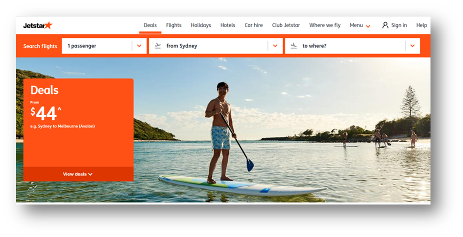
The ‘Search Flights’ functionality is placed in different section of the page, depending upon which page a user is visiting. Figure 1 below shows the search flights function on Home Page.
Why this is a problem
It is important to have a consistence across all pages where the search functionality is placed so that users don’t need to look for and locate where the search functionality is. Placing search functionality in different section of the page may increase users’ cognitive load and have a negative impact on conversions.
User observations and findings
A user testing study was conducted with two users. To better understand how the current experience resonates with travel seekers, users were given two tasks to complete on Jetstar Home Page.
Targeted audience
Two males between 34-36, working in the retail industry
Booked a few domestic flights in the last three months
Mostly travel for pleasure purposes
Budget travellers, value for a price-savvy segment
User Task
Visit Jetstar Home Page and search one-way flight from Sydney to Auckland
Then, visit Deals Page and search one-way flight from Auckland from Wellington
Observer Questions
Was it easy or difficult to locate & use the ‘search flights’ function on Home Page?
Was it easy or difficult to locate & use the ‘search flights’ function on Deals Page?
Findings
Both users expressed that it is not easily accessible to the ‘search flights’ function on Home Page since it is placed at further down to the page. And both noted that it is confusing the placement of the ‘search flights’ function as it changes when visiting the ‘Deals’ Page
Solution
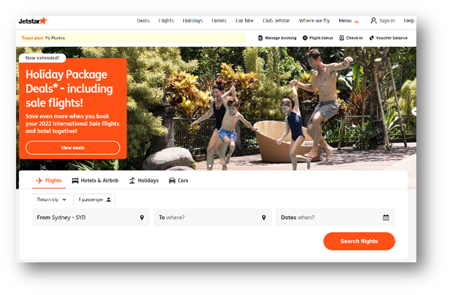
Keep the ‘Search flights’ function at top of the page across all Jetstar pages. Figure 2 shows how to display the search functionality.
Why this is a solution
Consistent page layout with the ‘search flights’ functionality placed across at top of the page minimize users’ cognitive load as users are jumping from one page to another and increase the conversion rates.